Case study · Responsive e-commerce · Student team project
A bookshop built on
what readers tell each other.
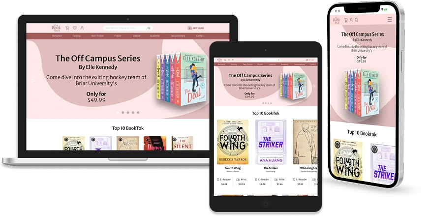
The Book Shelf is a digital bookshop for people who are already part of a reading community. It carries print and e-books, and it is built so that readers recommend titles to each other rather than being sold to by an algorithm alone. I designed and built the site.
The problem
Digital bookshops sell books. They do not hold readers.
The brief started from a gap the team found in the existing shops: format and customisation problems are annoying, but the real drawback is that none of them has a community around it. There is nowhere for readers to interact, recommend or stay, so the shop is a checkout and nothing more.
The team's research backed that up, and two numbers in particular pointed straight at the answer.
People already find their next book through other people. The shop was built to put that where the buying happens: readers share what they are reading, follow other readers' taste, and the recommendations come from the community rather than only from the store.
The feature I designed
A shelf that learns your taste.
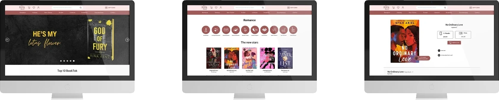
The research pointed one way: people find their next book through other people, not through a store's front page. So the piece I designed for the site is a recommender that works the same way, quietly, in the background. It reads what a reader has bought and tells them plainly whether a title is a match for their shelf, right on the book's page.
It is the one part of the build that is fully mine, from the idea to the interface.

Process
Structure first, then skin.
I laid the whole site out in wireframes before any colour went down, so the structure was settled before the look was. The same three screens, the home page, a category and a book page, carried straight through to the finished design. The match indicator was in the wireframe from the start, which is how I knew the recommender was a structural decision and not a sticker added at the end.
Wireframe

Interface
Decisions
Building the site.
My part of the project was the site itself. These are the calls that shaped it.
I argued the palette, and changed it
I was not comfortable with the palette we started from. It did not carry the atmosphere we had agreed the shop should have, and a bookshop that wants to feel like a room you stay in cannot look like any other store.
So I raised it with the team and made the case rather than quietly working around it. We rebuilt the palette together, and the version we landed on felt both more accurate to the brand and safer for a shopping flow. It is the decision on this project I am most sure about.
Pretty, but still a shop
The site had to be attractive enough to browse for pleasure and plain enough to buy from without thinking. Those two pull against each other, and on an e-commerce site the second one wins whenever they collide.
Designed for the phone too
The brief was a responsive site, not a desktop site that survives a small screen. The buying flow had to stay as clear and as consistent on a phone as it is on a monitor, which is where most of the layout work went.
Honest notes
What's mine, and what isn't.
A team project
The Book Shelf was made by a student team of three. The research, the personas and the written case study were team work. My own contribution was the site: the interface, the layouts, the responsive behaviour and the AI recommender, plus a hand on some of the presentation.
A student brief, not a live shop
The shop does not exist. The titles, prices and copy are stand-in content built to fill out a real buying flow, and nothing here was shipped to real customers.