Case study · Brand identity + e-commerce · Solo final project
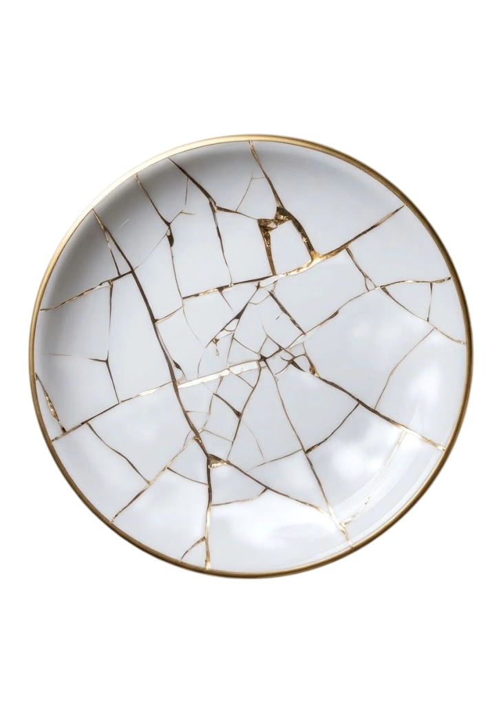
A broken plate,
built into a brand.
Kintsu takes kintsugi, the Japanese craft of repairing ceramics with gold, and turns it into a full brand: a visual identity, a product line, and a full e-commerce site with a catalog, a cart and a checkout. I designed and built every part of it myself, and it ran across my whole time at HackerU rather than a final few weeks.
Behind the project
A project that grew with the course.
Kintsu was not a final-week brief. I started it in my first days at HackerU and kept building it to the end, putting every new tool I learned into this one project instead of into a throwaway exercise. It is the piece I put the most work into.
I picked kintsugi because it is a clean, very particular craft and I wanted to work my way into home and decor. It looked like the least accessible direction I could have chosen, which is exactly why I chose it.
The audience I designed for is deliberately wide: people from 25 to 70 who buy good pieces for their home. That ruled out a young, trend-led look early on and pushed the whole thing toward something calmer and more lasting.
The print pieces and the online branding.
The KINTSU logotype.
The full brand book.
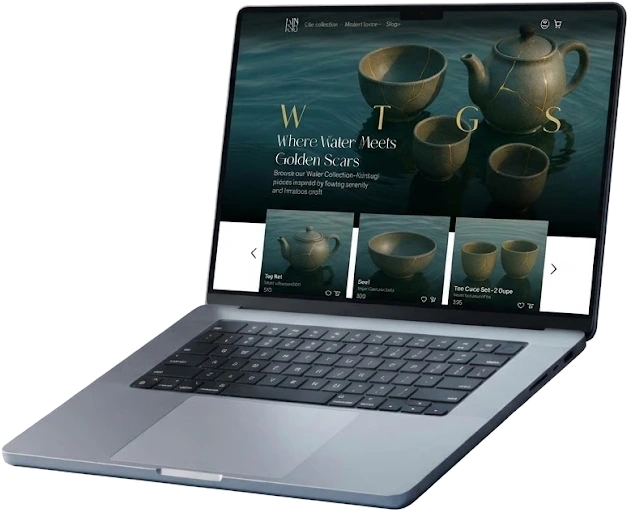
The e-commerce site, plus a mobile version of the homepage.
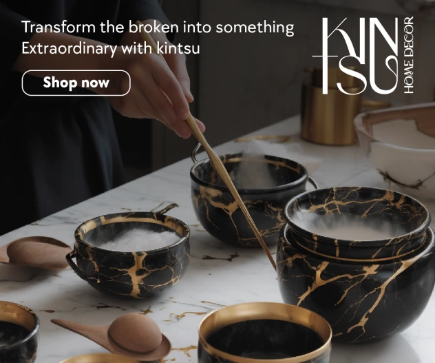
Built in Photoshop for Kintsu Home Decor, with the same line and the same lockup carried across three banner formats: a tall skyscraper, a square and a landscape. It was the first place the identity had to hold up outside the brand book.
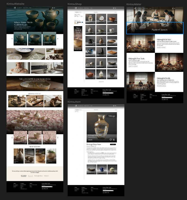
Seven frames carry the whole site: the homepage, the shop, the masterclasses page, the product page and three states of the cart and checkout. Four of them are here. Laying them out side by side is how I kept the header, the product cards and the type consistent across the set, since there was no component library doing it for me.
Decisions
Four choices that shaped the shop.
The site itself is a straightforward shop: home, catalog, cart, checkout, with Jewelry and Home Decor sharing one catalog behind a tab at the top and the product opening inside the catalog rather than on a page of its own. The structure was never the hard part, so these are the four choices that were.
None of them came out of user testing, because there was none to run on a student brand. They came out of looking at what the product line actually is and what it needs from an interface.
Quiet interface, loud products
The palette stays restrained and gold shows up only as an accent, the same place it shows up on the pieces.
Every product in this catalog already has gold running through it. An interface with a strong voice of its own would have competed with the merchandise instead of framing it, so the UI gives the photography the room and stays out of the way.
Filter by price and color, not by type
The catalog filters on two attributes only: price and color.
Jewelry and Home Decor sit in one catalog on purpose. A filter by product type would have split apart the thing the tab had just joined, while price and color are the two attributes every piece shares no matter which line it belongs to.
Vintage marked on the card

Vintage pieces carry a label in the grid itself, not behind a filter.
They are one of a kind and they are priced differently from the standard line. Flagging them in the grid sets that expectation before someone opens the page rather than after, which is the point in the flow where a surprise costs you the sale.
Explain the craft before selling it
The homepage runs the hero, the brand story, the restoration process and the craft behind the pieces, and only then Best Sellers.
A brand nobody has heard of, asking a premium for ceramics that are deliberately broken, has to make the case for the craft first. Leading with products would have made the prices look arbitrary.
The identity
A name that puts the repair in your room.
Kintsu joins kintsugi, the gold repair, to su, for space. The whole idea of the brand sits in the name: the craft of mending broken things, brought into the space someone actually lives in. The logotype then stacks KIN over TSU around a single crossbar, so the mark itself reads the way a kintsugi seam runs through a piece.

Typefaces
Color palette
Honest notes
What's real here, and what isn't.
What this project is
Kintsu is a brand I invented, with no team and no client. The products, prices and catalog copy are mockup content built to fill out a real e-commerce flow, not a shop you can buy from, and every image in it was generated with AI. The identity, the brand book, the layouts and the screens are my own design work.
What I would do differently
I would build it with the tools that exist now and push it further on accessibility. I would also design the whole site for mobile, not only the homepage: the desktop screens are the finished part of this project, and the phone is where it stops short.